時の流れをつむぐ酒「敷嶋0歩目」 ブランディング・デザイン
“Sake that bridges the passage of time" Designed label for Japanese Sake "Shikishima Step 0"
“Sake that bridges the passage of time" Designed label for Japanese Sake "Shikishima Step 0"
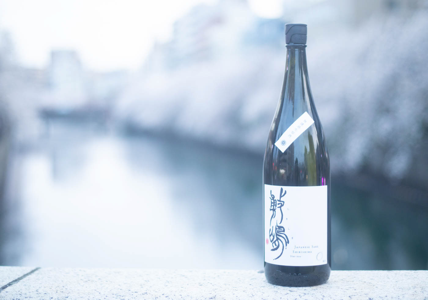
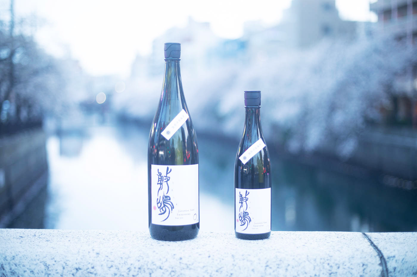
Itoh Sake brewery that was founded in 1788, but closed its 212-year history 20 years ago. To revive the sake brewery, Mr. Masaru Ito quit his job to train as a Sake brewer, and reached the revival brand of sake "Shikishima step 0”.
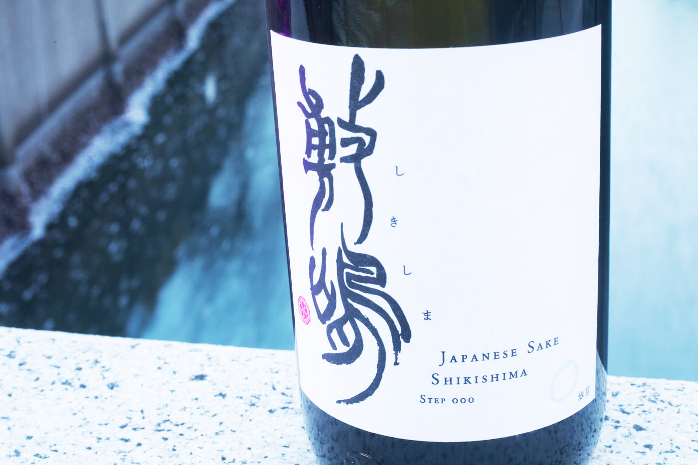
We had the pleasure of creating the label for this important sake together with Miss. 田坂 州代 (Kuniyo Tasaka), a female calligrapher who represented Japan at the Paris Japan Expo. I was in charge of branding, creative direction, art direction, copywriting, and design.
Mr. Ito was working for a major telecommunications company when he decided to quit his job. The story of a man who aspires to revive his family's sake brewery, which is his origin, and who trained himself in sake making and revived the traditional brand of Shikishima in a new way. Also the essence of sake, "water is the lifeblood of sake," overlaps with the concept of "sake that nurtures to the headwater. Then, based on the concept, I asked Miss. Tasaka to draw with an image of "the flow of the headwaters".
The origin of the name "Shikishima" is a tanka poem by Motoki Norinaga
(Modern translation: If you ask me what "Yamato Gokoro" means, I would answer that it is like the beauty of mountain cherry blossoms shining in the morning sun. Therefore, since the previous label had a cherry blossom family crest on it, we designed a new cherry blossom crest to go with the calligraphy.
(Modern translation: If you ask me what "Yamato Gokoro" means, I would answer that it is like the beauty of mountain cherry blossoms shining in the morning sun. Therefore, since the previous label had a cherry blossom family crest on it, we designed a new cherry blossom crest to go with the calligraphy.
Mr.Itoh sees the revival of the sake brewery as the real first step, and with the humble thought that the revival of sake is the 0th step so that the new Shikishima was given the name "Shikishima Step 0".
"Shikishima Step 0" spun the flow of time in a sake brewery that had been cut off, leading to a new step in the revival of the brewery. And we designed the label with our thoughts to convey the Japanese spirit to our customers.
It is now on sale at various liquor stores. The online shop is still in the works, but you can buy it by messaging Itoh san.
天明8年(1788年)創業でありながら、20年前に212年の歴史を閉じた酒蔵・伊東。その酒蔵の復興を目指し、会社勤めから脱サラし、酒造りの修行を積んだ伊東 優 (Masaru Ito)さんがついに復活まで漕ぎ着けた決意の一本が「敷嶋0歩目」です。
パリジャパンエキスポで日本代表を務めた女流書家・田坂 州代 (Kuniyo Tasaka)先生とともに、この大事な新作のラベルの制作をさせていただきました。僕は、ブランディング、クリエイティブディレクション、アートディレクション、コピーライト、デザインを担当させていただきました。
まず、伊東さんの「大手通信会社に勤めていながら一念発起し脱サラ。自らの源流であるご実家の酒蔵の復興を志し、酒造りの修行を積み、敷嶋という酒蔵伝統の銘柄を新しい形で復活させた」というストーリー、そして「酒は水が命」というお酒の本質が重なり合い「源流をつむぐ酒」というコンセプトをつくりました。そしてコンセプトをもとに、田坂先生に「源流の流れをイメージした書」をしたためていただきました。
「敷嶋」の名前の由来は本居宣長(もとおりのりなが)の短歌「しき嶋のやまとごころを人とはば朝日ににほふ山ざくら花(現代語訳:大和ごころとはどういうものかと問われたら、朝日に照り輝く山桜の美しさのようなものだと私は答えよう)」に由来するとのこと。そのため以前のラベルには桜の家紋が添えられていたという背景もあり、桜の家紋も新しくデザインさせていただき、書に添える印としました。
そして、酒蔵復興を本当の1歩目と捉えているということで、お酒の復活は0歩目という謙虚な想いを受けた新生敷嶋は、「敷嶋0歩目」という名称になりました。
敷嶋0歩目が「断たれてしまった酒蔵の時間の流れを紡ぎ、新たな酒蔵の一歩に繋がる。そして、お客様に日本人の大和心を伝えられるように、想いを込めてラベルをデザインさせていただきました。現在、様々な酒屋さんで取り扱っていただき発売中です。オンラインショップはまだ準備中ですが、伊東さんにメッセージするとご購入いただけます。